Ark UI's Avatar is a fully functional, unstyled component that comes with built-in accessibility features like fallbacks when the image fails to load.
In this post, we'll walk through designing the Avatar component with Vanilla CSS and Panda CSS, including support for sizes, shapes, and visual variants that you might use across a design system.
Anatomy
To set up the avatar correctly, you'll need to understand its anatomy and how we name its parts. Each part includes a
data-part attribute to help identify them in the DOM.
- root - The outer wrapper of the avatar
- image - The user's profile image
- fallback - If the image is missing, broken, or slow to load, the fallback is shown instead
Below is the simple usage of the Avatar component:
import { Avatar } from '@ark-ui/react/avatar'

export const Basic = () => (
  <Avatar.Root>
    <Avatar.Fallback>PA</Avatar.Fallback>
    <Avatar.Image src="https://i.pravatar.cc/300?u=a" alt="avatar" />
  </Avatar.Root>
)
When rendered in the DOM, it looks like
<div data-scope="avatar" data-part="root">
  <img data-scope="avatar" data-part="image" />
  <span data-scope="avatar" data-part="fallback">EA</span>
</div>
Each part of avatar component comes with data attributes like:
data-scope="avatar"data-part="root" | "image" | "fallback"
This makes styling predictable for reusable design systems because you don't need to invent class names like
.my-avatar-img or worry about conflicts.
Styling
Most components come in different sizes, shapes, and variants, and if you're not intentional with how you style, your styles can quickly get out of hand.
That's why it helps to start thinking in recipes.
A recipe is a structured way to define styles for a component including all its parts and variants in one place. With a recipe, you can:
- Set up base styles that apply to every instance of the component.
- Add size variants (e.g.,
sm,md,lg) that adjust dimensions and font size. - Include visual variants (e.g.,
subtle,solid,outline) for different use cases. - Control shape variants (e.g.,
rounded,square,circle) to match your design system.
Essentially, recipes help you group related styles together and reuse them in a consistent way.
This keeps your components clean, your code easier to manage, and your design system more maintainable over time.
Here's a breakdown of the available configuration options for the Avatar.
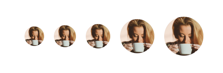
Size Options
This affects both the width/height and font size (for fallback initials). Available values are:
xs– extra smallsm– smallmd– mediumlg– largexl– extra large
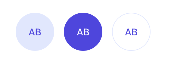
Variant Options
The variant property controls the background and text color styles for the avatar.
Available values are:
subtle– light background with accent textsolid– bold background with white textoutline– transparent background with a border
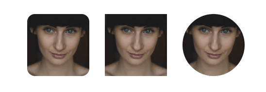
Shape Options
The shape option determines the avatar's border-radius. Available values are:
rounded– slightly rounded cornerssquare– hard edgesfull– fully circular
Vanilla CSS
Let's start by styling the Avatar using Vanilla CSS. To implement this, leverage CSS variables as much as possible to avoid repetition.
You can find the full source code for this project on GitHub.
Base Styles
These are the default, foundational styles applied to a component before any customization. Use data-scope="avatar"
and data-part attributes to target the different parts.
Add the following to your avatar.css stylesheet:
/* Avatar root */
[data-scope='avatar'][data-part='root'] {
  display: inline-flex;
  align-items: center;
  justify-content: center;
  position: relative;
  font-weight: 500;
  vertical-align: top;
  user-select: none;
  flex-shrink: 0;

  width: var(--avatar-size, 40px);
  height: var(--avatar-size, 40px);
  font-size: var(--avatar-font-size, 1rem);
  border-radius: var(--avatar-radius, 9999px);
}

/* Avatar image */
[data-scope='avatar'][data-part='image'] {
  width: 100%;
  height: 100%;
  object-fit: cover;
  border-radius: var(--avatar-radius, 9999px);
}

/* Fallback */
[data-scope='avatar'][data-part='fallback'] {
  font-size: var(--avatar-font-size, 1rem);
  font-weight: 500;
  line-height: 1;
  text-transform: uppercase;
  border-radius: var(--avatar-radius, 9999px);
}
Size Variant
Define classes for the small and large sizes using CSS variables.
.avatar--xs {
  --avatar-size: 2rem;
  --avatar-font-size: 0.75rem;
}

.avatar--sm {
  --avatar-size: 2.25rem;
  --avatar-font-size: 0.875rem;
}

.avatar--md {
  --avatar-size: 2.5rem;
  --avatar-font-size: 1rem;
}

.avatar--lg {
  --avatar-size: 2.75rem;
  --avatar-font-size: 1rem;
}

.avatar--xl {
  --avatar-size: 3rem;
  --avatar-font-size: 1.125rem;
Shape Variants
Change the look of the Avatar with shape variants
.avatar--rounded {
  --avatar-radius: 12px;
}

.avatar--square {
  --avatar-radius: 0px;
}

.avatar--full {
  --avatar-radius: 9999px;
}
Visual Variants
Lastly, define the look and feel of a component.
.avatar--subtle {
  background-color: #e0e7ff;
  color: #4f46e5;
}

.avatar--solid {
  background-color: #4f46e5;
  color: #ffffff;
}

.avatar--outline {
  background-color: transparent;
  color: #4f46e5;
  border: 1px solid #e0e7ff;
}
Using the Recipe
Now that we've defined our base styles, added a few sizes, shapes, and visual style variants, let's put them all together to see how it works in practice.
Here's how you can apply styles to your avatar component using classes like avatar--sm, avatar--rounded, or
avatar--solid.
<Avatar.Root className='avatar--sm'>
  <Avatar.Fallback>AB</Avatar.Fallback>
  <Avatar.Image src='https://i.pravatar.cc/300?u=a' alt='avatar' />
</Avatar.Root>

<Avatar.Root className='avatar--rounded'>
  <Avatar.Fallback>AB</Avatar.Fallback>
  <Avatar.Image src='https://i.pravatar.cc/300?u=a' alt='avatar' />
</Avatar.Root>

<Avatar.Root className='avatar--solid'>
  <Avatar.Fallback>AB</Avatar.Fallback>
  <Avatar.Image src='https://i.pravatar.cc/300?u=a' alt='avatar' />
</Avatar.Root>
Combining size, variant and shape Classes
In addition to applying individual size classes, you can enhance the avatar's visual appearance by combining multiple class-based variants.
This helps you get more flexibility and consistency across your UI components.
Here's a full example of how you'll use the defined styles on the Avatar.
<Avatar.Root className="avatar--lg avatar--solid avatar--full">
  <Avatar.Fallback>AB</Avatar.Fallback>
  <Avatar.Image src="https://i.pravatar.cc/300?u=a" alt="avatar" />
</Avatar.Root>
This example renders a large, solid and fully rounded avatar.
Panda CSS
Recipes are a built-in concept in Panda CSS and they integrate nicely with Ark UI components. To organize styles cleanly across all parts of a component, we use a slot recipe. Slot recipes come in handy when you need to apply style variations to multiple parts of a component.
We'll also be using the built in design tokens in Panda CSS.
You can find the full source code for this project on GitHub.
Base Styles
To define the base styles, define a slot recipe, using the sva function, which maps to data-scope="avatar" and
data-part attributes.
A slot recipe has 5 main properties: slots, className, base, variants and defaultVariants.
Create an avatar.ts file and add the following to it
// recipes/avatar.ts

import { sva } from '../../styled-system/css'
import { avatarAnatomy } from '@ark-ui/react/avatar'

export const avatarSlotRecipe = sva({
  slots: avatarAnatomy.keys(),
  className: 'avatar',
  base: {
    root: {
      display: 'inline-flex',
      alignItems: 'center',
      justifyContent: 'center',
      position: 'relative',
      fontWeight: 'medium',
      userSelect: 'none',
      flexShrink: '0',
      verticalAlign: 'top',
      w: '10',
      h: '10',
      fontSize: 'md',
      borderRadius: 'full',
    },
    image: {
      w: 'full',
      h: 'full',
      objectFit: 'cover',
      borderRadius: 'inherit',
    },
    fallback: {
      lineHeight: '1',
      fontWeight: 'medium',
      textTransform: 'uppercase',
      fontSize: 'md',
      borderRadius: 'inherit',
    },
  },
})
avatarAnatomy.keys()is equivalent to listing out each part like so[root, fallback, image]
Size Variant
Define the recipe for the size within the size key.
import { sva } from '../../styled-system/css';
import { avatarAnatomy } from '@ark-ui/react/avatar'

export const avatarSlotRecipe = sva({
  slots: avatarAnatomy.keys(),
  className: 'avatar',
  base: {
     ... // base styles here
  },
   variants: {
    size: {
      xs: {
        root: { w: '8', h: '8', fontSize: 'xs' },
      },
      sm: {
        root: { w: '9', h: '9', fontSize: 'sm' },
      },
      md: {
        root: { w: '10', h: '10', fontSize: 'md' },
      },
      lg: {
        root: { w: '14', h: '14', fontSize: 'lg' },
      },
      xl: {
        root: { w: '16', h: '16', fontSize: 'xl' },
      },
    },
  },
});
Shape Variants
Define the recipe for the shape within the shape key.
import { sva } from '../../styled-system/css';
import { avatarAnatomy } from '@ark-ui/react/avatar'

export const avatarSlotRecipe = sva({
  slots: avatarAnatomy.keys(),
  className: 'avatar',
  base: {
      ... // base styles here
  },
  variants: {
    shape: {
      rounded: {
        root: { borderRadius: 'lg' },
      },
      square: {
        root: { borderRadius: '0' },
      },
      full: {
        root: { borderRadius: 'full' },
      },
    },

    },
  },
});
Visual Variants
Define the recipe for the visual variants within the variant key.
import { sva } from '../../styled-system/css';
import { avatarAnatomy } from '@ark-ui/react/avatar'

export const avatarSlotRecipe = sva({
  slots: avatarAnatomy.keys(),
  className: 'avatar',
  base: {
      ... // base styles here
  },
  variants: {
   variant: {
      subtle: {
        root: { bg: 'indigo.100', color: 'indigo.600' },
      },
      solid: {
        root: {
          bg: 'indigo.600',
          color: 'white',
        },
      },
      outline: {
        root: {
          bg: 'transparent',
          color: 'indigo.600',
          border: '1px solid #e0e7ff',
        },
      },
    },
  },
});
It's a good practice to define defaultVariants when setting up your recipe. This allows you to specify which variant
values should be applied automatically if no specific variant is provided.
In this case you can set the default variants as sm, full and subtle.
import { sva } from '../../styled-system/css';
import { avatarAnatomy } from '@ark-ui/react/avatar'

export const avatarSlotRecipe = sva({
  slots: avatarAnatomy.keys(),
  className: 'avatar',
  base: {
      ... // base styles here
  },
  variants:
		  ... // variants styles here
  },
   defaultVariants: {
    size: 'sm',
    shape: 'full',
    variant: 'subtle',
  },
});
Using the Recipe In Your Component
To use this recipe in your component, import it:
 //avatar.tsx

import { avatarSlotRecipe } from './recipes/avatar';
Next, generate the styles for each part of the component:
const classes = avatarSlotRecipe()This returns an object with styles for each slot: root, image, and fallback.
You then apply the styles to each component part like this:
<Avatar.Root className={classes.root}>
  <Avatar.Fallback className={classes.fallback}>PA</Avatar.Fallback>
  <Avatar.Image className={classes.image} src="https://i.pravatar.cc/300?u=a" alt="avatar" />
</Avatar.Root>
Combining size, variant and shape
In addition to applying individual size classes, you can enhance the avatar's visual appearance by combining multiple class-based variants. This helps you get more flexibility and consistency across your UI components.
import { avatarSlotRecipe } from './recipes/avatar'

const classes = avatarSlotRecipe({ size: 'lg', variant: 'solid', shape: 'rounded' })

<Avatar.Root className={classes.root}>
  <Avatar.Fallback className={classes.fallback}>PA</Avatar.Fallback>
  <Avatar.Image className={classes.image} src="https://i.pravatar.cc/300?u=a" alt="avatar" />
</Avatar.Root>
This example renders a large, solid-colored, fully rounded avatar.
Conclusion
Ark UI gives you the building blocks, but how you style those blocks is entirely up to you. Whether you're using Vanilla CSS or a more scalable system like Panda CSS, the important thing is setting up your variants, sizes, and styles in a way that's easy to reuse and maintain as your design system grows.