Unstyled UI components for your Design System
A headless library with 45+ accessible components. Bring your own styles and build a design system that works across React, Solid, Vue, and Svelte.
React
Solid
Vue
Svelte
Truly Headless
No default styles to fight. Bring your own CSS — Panda, Tailwind, CSS-in-JS, or plain stylesheets.
Framework Agnostic
Write once, use everywhere. The same API works across React, Solid, Vue, and Svelte.
Accessible by Default
WAI-ARIA patterns baked in. Keyboard navigation and screen reader support out of the box.
State Machine Powered
Predictable behavior you can rely on. Complex interactions handled with edge cases covered.
import { Slider } from '@ark-ui/react/slider'
import { useState } from 'react'

export const MySlider = () => {
  const [value, setValue] = useState([30])

  return (
    <Slider.Root
      min={-50}
      max={50}
      value={value}
      onValueChange={(e) => setValue(e.value)}
    >
      <Slider.Label>Label</Slider.Label>
      <Slider.ValueText>{value}</Slider.ValueText>
      <Slider.Control>
        <Slider.Track>
          <Slider.Range />
        </Slider.Track>
        <Slider.Thumb index={0} />
      </Slider.Control>
    </Slider.Root>
  )
}
import { Slider } from '@ark-ui/solid/slider'
import { createSignal } from 'solid-js'
export const MySlider = () => {
const [value, setValue] = createSignal([30])
return (
<Slider.Root
min={-50}
max={50}
value={value()}
onValueChange={(e) => setValue(e.value)}
>
<Slider.Label>Label</Slider.Label>
<Slider.ValueText>{value}</Slider.ValueText>
<Slider.Control>
<Slider.Track>
<Slider.Range />
</Slider.Track>
<Slider.Thumb index={0} />
</Slider.Control>
</Slider.Root>
)
}<script lang="ts">
import { Slider } from '@ark-ui/svelte/slider'
let value = $state([30])
</script>
<Slider.Root bind:value>
<Slider.Label>Label</Slider.Label>
<Slider.ValueText />
<Slider.Control>
<Slider.Track>
<Slider.Range />
</Slider.Track>
<Slider.Thumb index={0} />
</Slider.Control>
</Slider.Root><script setup lang="ts">
import { Slider } from '@ark-ui/vue/slider'
import { ref } from 'vue'
const value = ref([30])
</script>
<template>
<Slider.Root :min="-50" :max="50" v-model="value">
<Slider.Label>Label</Slider.Label>
<Slider.ValueText>{{ value }}</Slider.ValueText>
<Slider.Control>
<Slider.Track>
<Slider.Range />
</Slider.Track>
<Slider.Thumb :index="0" />
</Slider.Control>
</Slider.Root>
</template>Built with Ark UI
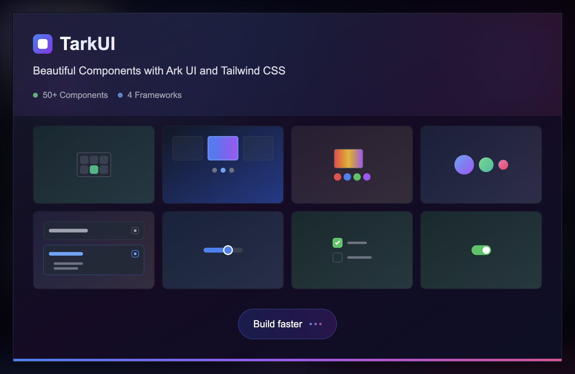
See What's Possible
Explore real-world applications built by developers who trust Ark UI. From startups to enterprises, see how our headless components power modern web experiences.


Driven by State Machines
to make your life easier.
Utilizing state machines, Ark UI substantially cuts down on errors while ensuring predictable behavior in every component. Develop with confidence.
Join the Ark UI Community
For insights, support, and updates, connect on Discord. For real-time news, follow us on Twitter.


