Nothing beats actually using your own tools to find the rough edges. Over the past few weeks, we've been dogfooding the Ark UI docs while building new components, and we kept running into the same friction: too much scrolling to find code, no way to see the component in action, and styling examples that felt disconnected from real-world usage.
So we fixed it.
Live Previews
Every example now has a live, interactive preview right above the code. No more copy-pasting into a sandbox just to see what something looks like. Click around, interact with the component, and then look at the code if you're curious.
The code itself is collapsed by default. We found that most of the time you just want to see what a component does before deciding if it's the right fit. Click "Show Code" when you're ready to dig in.
Real CSS Modules
This was the big one. We wrote CSS modules for every single component — over 50 of them — so you can see exactly how to style Ark UI in a real project.
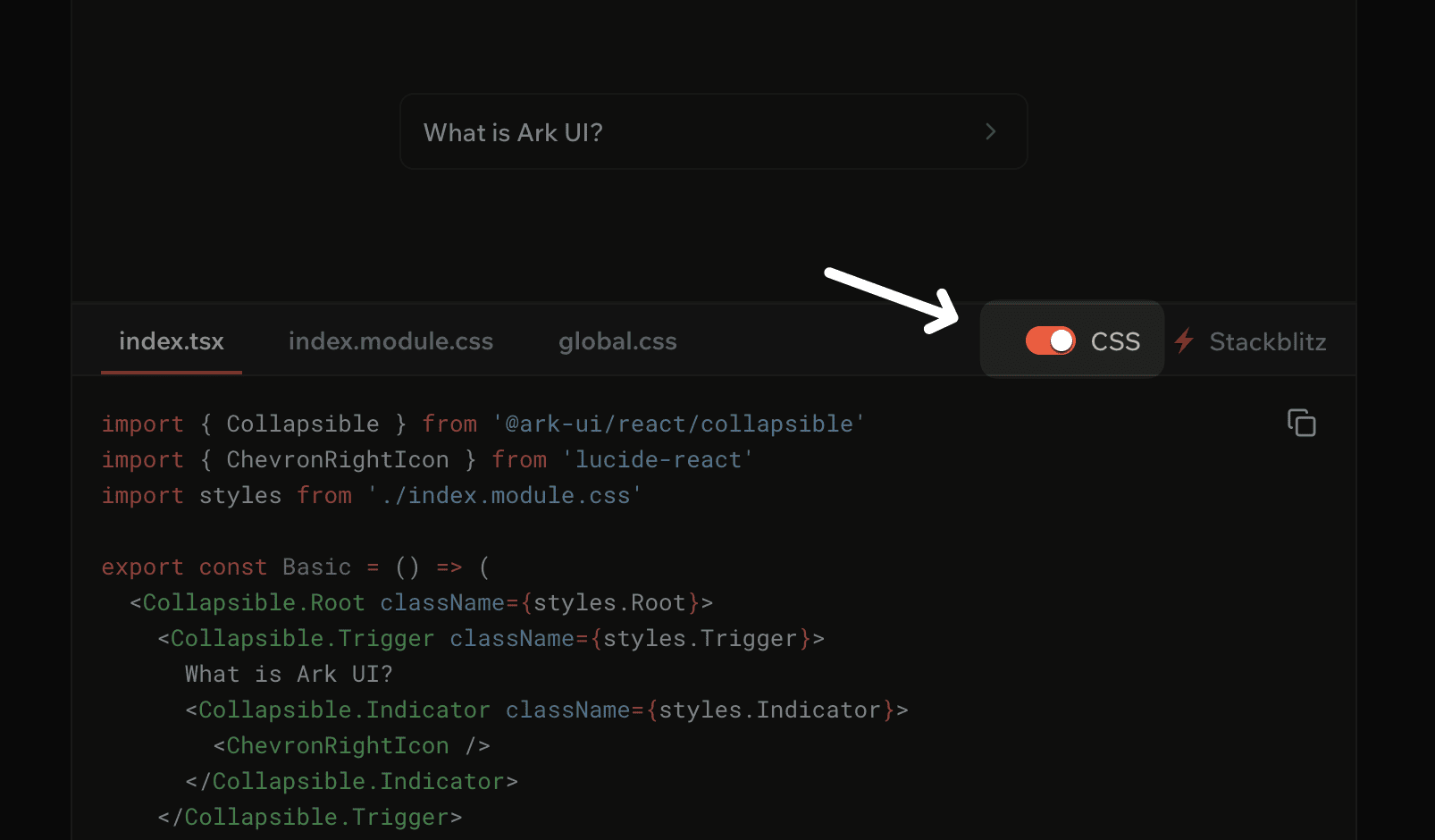
Here's what a Collapsible looks like:
import { Collapsible } from '@ark-ui/react/collapsible'
import { ChevronRightIcon } from 'lucide-react'
import styles from './collapsible.module.css'

export const Basic = () => (
  <Collapsible.Root className={styles.Root}>
    <Collapsible.Trigger className={styles.Trigger}>
      What is Ark UI?
      <Collapsible.Indicator className={styles.Indicator}>
        <ChevronRightIcon />
      </Collapsible.Indicator>
    </Collapsible.Trigger>
    <Collapsible.Content className={styles.Content}>
      <div className={styles.Body}>
        Ark UI is a headless component library for building accessible, high-quality UI components.
      </div>
    </Collapsible.Content>
  </Collapsible.Root>
)
And the CSS that powers it:
.Trigger {
  display: flex;
  align-items: center;
  justify-content: space-between;
  width: 100%;
  padding: 0.625rem 0.75rem;
  border: 1px solid var(--demo-border);
  border-radius: 0.5rem;
  background: transparent;
  cursor: pointer;

  &:hover:not([data-disabled]) {
    background: var(--demo-neutral-subtle);
  }

  &:focus-visible {
    outline: 2px solid var(--demo-coral-focus-ring);
    outline-offset: 2px;
  }
}

.Indicator {
  transition: transform 120ms ease;

  &[data-state='open'] {
    transform: rotate(90deg);
  }
}

.Content {
  overflow: hidden;

  &[data-state='open'] {
    animation: expand-height 120ms ease-out;
  }

  &[data-state='closed'] {
    animation: collapse-height 120ms ease-out;
  }
}
Notice how we're using Ark UI's data-state and data-disabled attributes for styling. No JavaScript state wiring
needed — the component handles all of that, and you just write CSS selectors. The styles work the same across React,
Solid, Svelte, and Vue.
We also set up a simple design token system with CSS variables (--demo-border, --demo-neutral-subtle, etc.) that you
can swap out for your own tokens. Dark mode support is baked in.
Streamlined Pages
We trimmed a lot of fat from the component pages. The "Features" bullet lists are gone — if you want to know what a component can do, the examples show you. Each page now follows a simple structure:
- Preview — See the component in action
- Anatomy — Understand the parts
- Examples — Learn the API through real code
CSS Toggle
Here's a small detail we're proud of: every code block has a CSS toggle in the top right corner.
Turn it on to see the full picture — component code with CSS module imports, plus tabs for index.module.css and
global.css. This is what you'd actually copy into a real project.
Turn it off and the code strips down to just the component logic. No className props, no style imports, just the
bare Ark UI anatomy. Useful when you're trying to understand what the component does without the visual noise.
We're pretty happy with how the docs turned out, but we're not done. We're working on more real-world examples, better search, and expanded guides for common patterns.
Check out the updated docs at ark-ui.com/docs and let us know what's missing.